

The 8-Point Grid System — Spacing, Typography, and Breakpoints Explained

Many websites don’t look bad.
They just don’t feel right.
Spacing feels inconsistent. Text sizes feel arbitrary. Layouts break oddly between screen sizes.
Users can’t explain it — but they sense it.
That friction almost always comes from the same root issue: every dimension on the page — spacing, type size, and the breakpoints that reflow the layout — was chosen separately, by eye, with no shared logic tying them together.
The fix is a single mathematical scale, applied consistently across all three.
What Is the 8-Point Grid System?
The 8-point grid system is a design methodology that sizes and spaces every UI element — margins, padding, gaps, type sizes, and breakpoints — using multiples of 8. Instead of picking values by eye, every dimension is chosen from one shared scale: 8, 16, 24, 32, 40, 48, 64, 80, 96, and so on.
It is not just a spacing convention. Applied properly, the same base unit governs three layers of a design system at once: layout rhythm, typography, and responsive behavior.
This isn’t a web-design invention. Baseline grids go back to print — Swiss typographers in the 1950s built entire layout systems around a fixed vertical rhythm so that text, images, and margins all shared one measure. The 8-point grid is that same idea, ported to screens: instead of a printer’s pica, the shared unit is a number that survives translation across every pixel density in the room.
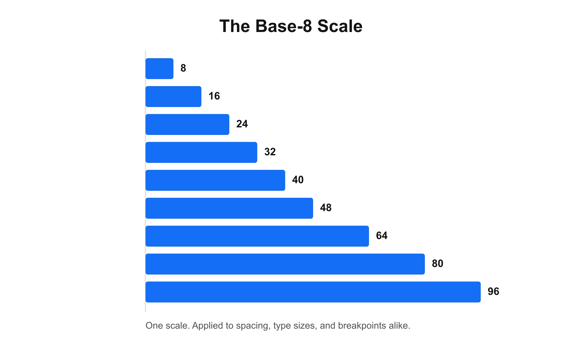
Why 8?
Most popular screen resolutions divide evenly by 8 on at least one axis, which keeps layouts crisp across standard device pixel ratios without half-pixel rendering issues.
8 also divides cleanly into both 2 and 4, which matters in practice: most 8-point systems pair an 8px grid for layout with a finer 4px sub-grid reserved for text and small details, so line-height and baseline alignment stay precise without breaking the larger rhythm.
There is also a simpler, practical reason: fewer choices. Restricting every dimension to one scale removes the vast majority of arbitrary spacing decisions a team would otherwise make one at a time — which is faster for designers and easier for developers to implement exactly as designed.
8px or 4px — Which Base Unit?
Not every production design system uses 8 as the primary unit. Shopify Polaris runs on 4px. The choice isn’t arbitrary:
| Base unit | Best for | Trade-off |
|---|---|---|
| 8px | Marketing sites, content-heavy layouts, dashboards with generous spacing | Coarser — can feel restrictive for dense, data-heavy UI |
| 4px | Data tables, admin panels, mobile UI with many small components | More flexibility, but more decisions — easier to drift into inconsistency without discipline |
Most teams don’t actually choose one over the other — they run 8px as the primary scale, 4px as a sub-grid for the cases where 8 is too coarse (fine typographic adjustments, icon padding, small component internals). That’s what Material and Carbon both do under the hood, and it’s the approach this system uses.
Who Actually Uses This
This isn’t a niche technique — it’s the default in most major design systems in production today:
- Google’s Material Design — the system behind Gmail, Google Drive, and Google Calendar — builds its spacing and layout guidance around this scale.
- IBM’s Carbon Design System — describes its 8px unit as the geometric foundation running through typography, grid columns, icons, and illustrations alike.
- Shopify’s Polaris — uses a closely related 4px base scale, the finer-grained cousin of the same idea, for the same reasons.
- Apple’s Human Interface Guidelines — reference similar spacing logic, though enforced less strictly than in Material or Carbon.
- Atlassian’s design system — documents its own structured spacing scale built on the same principle.
The pattern across all of them is the same: pick one small base unit, and derive every spacing and sizing decision from it instead of inventing a new number every time.
Applied: Onylogy’s Own Design System
Theory is easy to cite. Here’s where we actually used it.
When we audited Onylogy’s own site ahead of a spacing cleanup, we didn’t have to guess where the inconsistency was — pulling computed styles straight from the live pages showed it directly.
Before:
- Section row padding was already consistent (48/64/80px, all on the 8-point scale) — but horizontal row padding sat at 18px sitewide, off the grid entirely.
- Button padding split unpredictably between 12px/20px and 16px/24px across otherwise identical components, with no rule determining which a given button got.
- Paragraph spacing mostly followed 24px/48px, but a handful of instances dropped to 2px or 10px — leftover manual overrides.
After:
- Row horizontal padding standardized to
--space-2(16px) on mobile /--space-3(24px) on desktop, replacing the ad hoc 18px value used sitewide. - Button padding rule fixed by variant, not mixed arbitrarily: small buttons consistently
--space-1.5-style 12px/20px (4px sub-grid), large buttons consistently--space-2/--space-3— 16px/24px (8px grid) — same variant always gets the same pair, chosen by component size rather than per-instance. - The 2px and 10px paragraph-margin overrides removed; paragraphs fall back to the already-dominant
--space-3(24px) or--space-6(48px) depending on hierarchy, matching what most of the site already does correctly.
If you have a client project (even anonymized as “a SaaS dashboard client” with real, verifiable before/after metrics — page load, dev handoff time, QA rounds, whatever you actually measured), that’s a stronger case than the self-referential version above. Swap it in if available.
Spacing Rules That Actually Matter
The scale (8, 16, 24, 32…) tells you which numbers to use. It doesn’t tell you when to use which one. That part comes from a much older idea than grid systems: Gestalt’s law of proximity — things placed close together read as one group; things placed further apart read as separate.
That gives spacing an actual rule, not just a menu of allowed values:
Internal spacing should always be smaller than external spacing.
In practice:
- The padding inside a card (between its edge and its content) should be smaller than the margin between that card and the next one.
- The gap between a label and its input should be smaller than the gap between one form field and the next.
- The space between a heading and the paragraph it introduces should be smaller than the space above the heading.
Skip this rule and the 8-point grid stops helping — you can be perfectly on-grid (16px everywhere) and still produce a layout where nothing visually groups correctly, because every gap is the same size. The grid controls the numbers. Proximity controls which number goes where.
Applied example:
.card {
  padding: var(--space-3); /* 24px — internal */
  margin-bottom: var(--space-6); /* 48px — external, larger than internal */
}

.form-field label {
  margin-bottom: var(--space-1); /* 8px — label to input, tight */
}

.form-field + .form-field {
  margin-top: var(--space-4); /* 32px — field to field, looser */
}
Chapter 1: Spacing & Layout Rhythm
Spacing is the most common entry point into this system, and the easiest to feel the difference from.
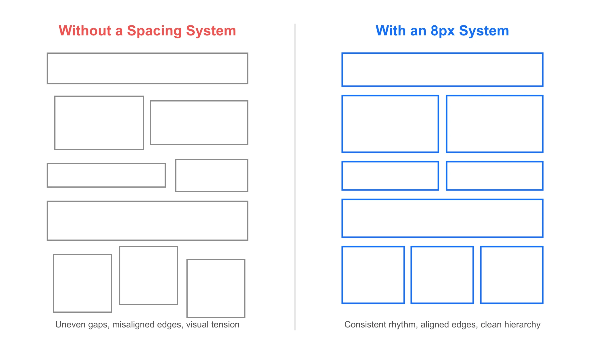
Designers often choose spacing by eye — a 13px margin here, a 22px gap there, a 37px section break somewhere else. Over time this produces inconsistent rhythm, bloated CSS, layout drift, and unpredictable responsiveness. It isn’t a design failure so much as a systems failure: nothing was tying the numbers together.
The fix: every spacing value — margin, padding, gap — is chosen from the same 8, 16, 24, 32… scale. No exceptions, no arbitrary values.
Example Implementation
In code, this is implemented as spacing tokens rather than hand-typed values:
:root {
  --space-1: 8px;
  --space-2: 16px;
  --space-3: 24px;
  --space-4: 32px;
  --space-5: 40px;
  --space-6: 48px;
  --space-8: 64px;
  --space-10: 80px;
}
Developers choose a token instead of a custom number. Spacing becomes a system variable, not a design guess — which means faster development, fewer overrides, and a cleaner codebase.
When to Break the Grid
An 8-point grid is a default, not a law. Three places where professionals deliberately step off it:
| Case | Why it breaks the grid | What to do instead |
|---|---|---|
| 1px hairline borders / dividers | A border needs to render at exactly 1 physical pixel to stay crisp — 8, 4, even 2 all overshoot | Keep borders at 1px regardless of scale; treat them as a stroke, not a spacing value |
| Icon grids | Most icon sets are drawn on a 24px (or 20px) canvas with internal geometry that doesn’t subdivide cleanly into 8s | Let the icon’s frame sit on the grid (24px = 3 × 8) even if internal strokes don’t |
| Optical alignment | Circular or angled shapes (avatars, badges, arrows) can look mis-aligned at their literal bounding box even when the box is on-grid | Nudge by 1–2px to correct for what the eye perceives, not what the math says |
The rule of thumb: the grid governs structure (layout, spacing, component frames); it doesn’t govern every stroke inside a component. Breaking it without a reason is sloppy. Breaking it for a hairline border or an optical nudge is the system working as intended.
Chapter 2: Typography on the Same Scale
Type sizes are usually the second casualty of arbitrary decisions — a 15px body size here, a 23px heading there, with no relationship between them.
Under the 8-point system, heading sizes land on multiples of 8 (16, 24, 32, 40, 48, 64px), while smaller and finer text sizes are allowed to use the 4px sub-grid (12, 20px) — preserving legibility at small sizes without breaking the larger rhythm.
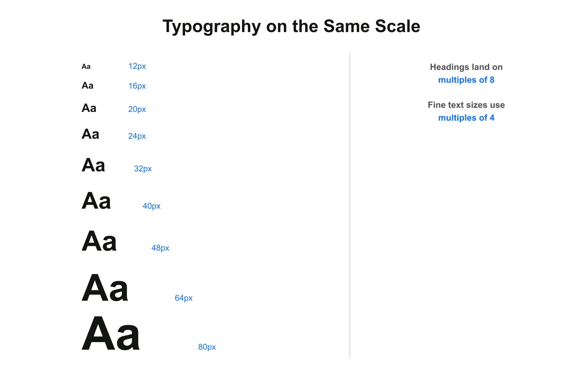
Line-height follows the same logic: kept on the 4px sub-grid so text baselines still align to the larger 8px layout grid, even though the type scale itself needs finer steps than layout spacing does.
Chapter 3: Responsive Breakpoints
The least obvious application: the breakpoints themselves — the widths at which a layout reflows for mobile, tablet, and desktop — are usually chosen on the same grid-friendly values. 320px, 768px, 1024px, and 1440px are all multiples of 8.
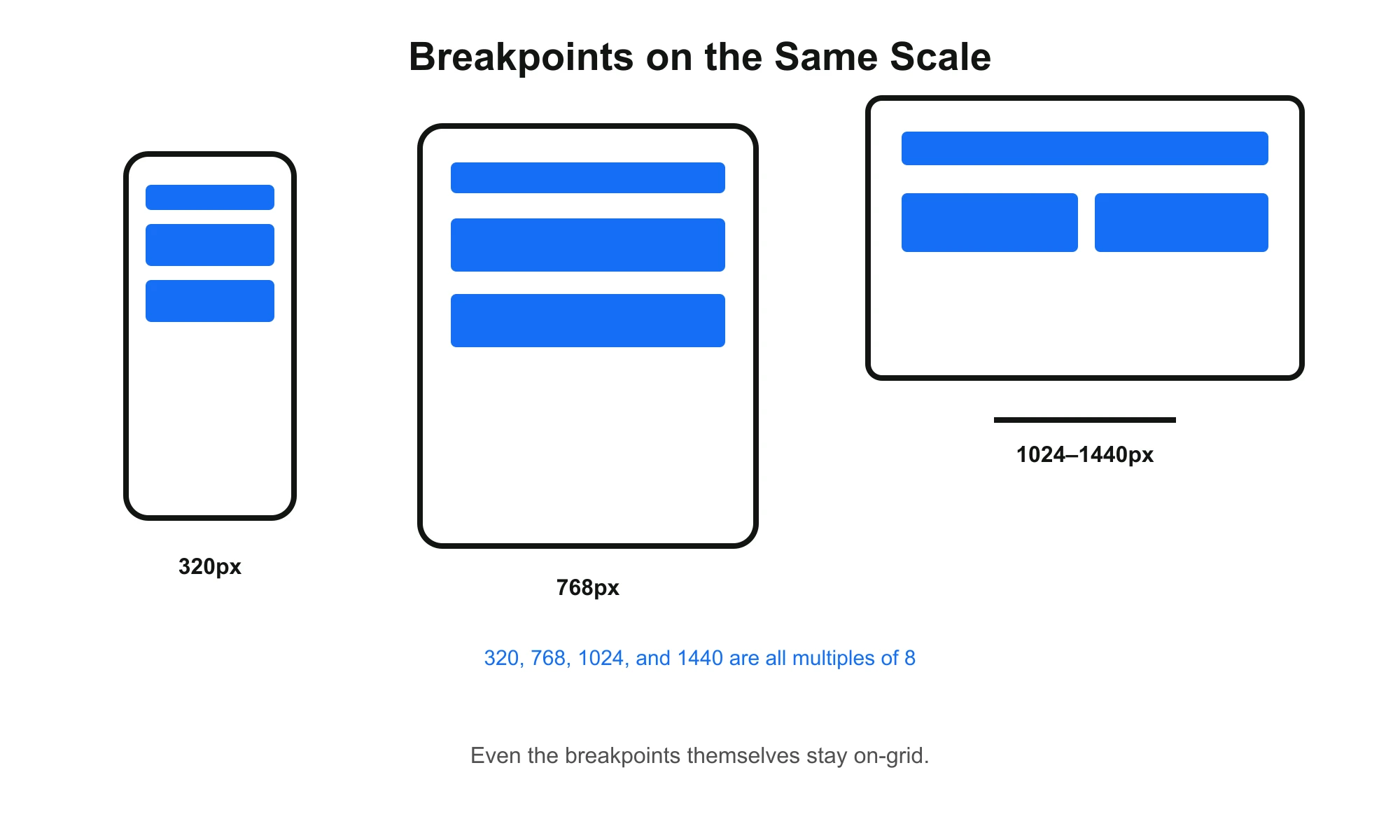
And because spacing values follow a consistent ratio, scaling a layout across breakpoints becomes mathematical rather than manual:
| Device | Section Spacing |
|---|---|
| Mobile | 48–64px |
| Tablet | 64–80px |
| Desktop | 80–96px |
No redesign required at each breakpoint — only scale adjustment.
Chapter 4: Accessibility & Touch Targets
A spacing system that only optimizes for visual rhythm and ignores who has to physically tap the interface isn’t finished. Every major system this article cites as a reference — Material, Apple HIG — pairs its spacing scale with a minimum touch target size, and that minimum lands on the same 8-based math:
- Apple Human Interface Guidelines: minimum tap target of 44×44pt
- Material Design: minimum tap target of 48×48dp
- WCAG 2.1 (Success Criterion 2.5.5): minimum target size of 44×44px for touch
Both 44 and 48 sit inside the same family as your spacing scale — 48 is –space-6. That’s not a coincidence; it means touch-target sizing isn’t a separate system bolted onto your spacing scale, it’s an extension of it.
Practical rule: any tappable element — button, icon button, checkbox, nav item — gets a minimum bounding box of 48px, even if the visible icon or label inside it is smaller. Use padding to expand the tap area rather than shrinking the touch target to match the visual asset.
.icon-button {
  width: var(--space-6);  /* 48px minimum tap target */
  height: var(--space-6);
  display: flex;
  align-items: center;
  justify-content: center;
}

.icon-button svg {
  width: 24px; /* visual icon can be smaller than the tap target */
  height: 24px;
}
Skipping this step is one of the most common gaps in otherwise “on-grid” interfaces: everything measures correctly and still fails usability testing on mobile, because tap targets were never separated from visual size.
Hard Grid vs. Soft Grid
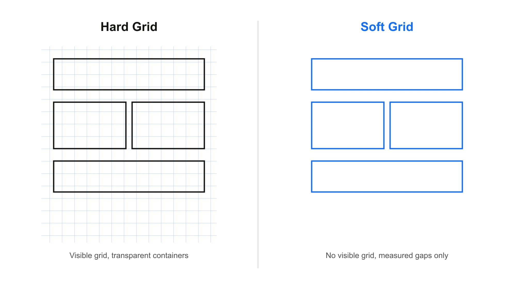
There are two common ways to actually implement this in a design tool. A Hard Grid overlays a visible 8px (or 4px) grid across the whole canvas, and every container snaps to it — useful early on, while the habit is still forming. A Soft Grid drops the visible overlay and simply measures the gap between elements in 8px increments — faster once the scale is second nature.
From Design File to Codebase: Figma, Tokens, and Tailwind
The CSS variables above are half the system. The other half is making sure the design side never drifts from the code side.
In Figma:
- Set your layout grid to an 8px (or 4px sub-grid) column/row grid so frames snap to it by default.
- Use Auto Layout’s gap property — set it in 8-based increments (8, 16, 24, 32) rather than typing arbitrary numbers.
- Define spacing as Figma variables (not just styles) — space-1 through space-10 — so designers reference the same names developers use in code, and a scale change propagates everywhere instead of requiring a manual sweep.
Bridging to code:
If you’re on Tailwind, note that its default spacing scale is 4px-based (p-1 = 4px, p-2 = 8px, p-4 = 16px) — it already speaks this language, with 4px as the sub-grid and every even step landing on your 8px scale. Mapping your Figma variables 1:1 to Tailwind’s spacing scale (or a custom theme.spacing config using the same –space-* values as the CSS above) means a designer’s “space-4” and a developer’s p-4/gap-4 refer to the literal same measurement — no translation layer, no rounding errors at handoff.
// tailwind.config.js — mapped 1:1 to the --space-* scale above
theme: {
  spacing: {
    1: '8px',
    2: '16px',
    3: '24px',
    4: '32px',
    5: '40px',
    6: '48px',
    8: '64px',
    10: '80px',
  }
}
This is the actual mechanism behind “design is engineering” — not a metaphor, but a literal shared source of truth between the design tool and the codebase.
Common Mistakes to Avoid
Adopting the grid doesn’t automatically produce good spacing. The failure modes we see most often:
- Treating it as decoration, not a constraint. Applying 8-based values to whatever spacing already “felt right” defeats the purpose — the grid should decide the number, not rubber-stamp a guess.
- Breaking the grid without a reason. Hairlines, icon internals, and optical nudges are legitimate exceptions. “This felt tight so I used 20px” is not.
- Ignoring the internal/external rule. Landing every gap on a valid 8-based number while ignoring proximity still produces a layout that doesn’t visually group correctly.
- Over-engineering the math. The point of the system is to remove decisions, not add ceremony. If your team is debating whether a gap should be 32 or 40 for more than a few seconds, the system has failed at its one job.
- Losing sight of the user for the sake of the system. A perfectly on-grid layout that fails a touch-target or readability check is still a failure. The grid serves the interface — not the other way around.
Measurable Impact
Where this system is applied consistently across spacing, type, and breakpoints together:
- design revisions decrease
- layout decisions happen faster, with fewer options to weigh
- CSS complexity drops
- visual consistency improves across every new page or section
- new breakpoints and components integrate without redesigning the base
The system reduces guesswork across the entire project lifecycle — not just at launch, but every time the site grows.
Why This Matters for Businesses
Clients don’t ask for an 8-point grid. They ask for professional design, a polished layout, and a website that scales without falling apart as it grows — and this system is what quietly delivers all three.
Most businesses don’t realize it, but the actual difference between an average website and a premium one is rarely more decoration. It’s structural discipline underneath.
Expert Insight — Design Is Engineering
The strongest approach treats design as a structured discipline, not an artistic guess. The strongest websites aren’t the most decorated — they’re the ones with the strongest internal systems, because spacing, type, and breakpoints influence every visual decision downstream: layout, components, responsiveness, and performance all get easier once the base scale is settled.
Key Insight
Most websites fail not because of poor design — but because they lack systems.
Further Resources
For anyone who wants to go deeper than this overview, these are real, well-documented references worth reading directly:
- Spec.fm — The 8-Point Grid: a concise, practical guide, including the Hard Grid vs. Soft Grid distinction referenced above.
- IBM Carbon Design System — 2x Grid: how a major enterprise design system documents its own 8px foundation.
- Shopify Polaris — Spacing: how Shopify implements the closely related 4px scale in a real production design system.
- Atlassian Design — Spacing: another real, production design system’s take on the same principle.
- Google Material Design 3: the design system behind Gmail, Drive, and Calendar, built around this scale from the ground up.
FAQ
Do I have to follow the 8-point grid 100% of the time?
No. Structure — layout, spacing, component frames — should stay on-grid. Exceptions exist for 1px borders, icon internals, and optical alignment (see “When to Break the Grid” above). The goal is fewer arbitrary decisions, not zero exceptions.
8px or 4px — which should I use?
Use 8px as your primary scale and 4px as a sub-grid for finer adjustments (typography, icon padding, small components). Pure 4px systems (like Polaris) work well for dense, data-heavy UI but demand more discipline to avoid drifting into inconsistency.
Does this still matter with responsive, fluid layouts?
More, not less. Fluid layouts already introduce variability in viewport width; a fixed spacing scale is what keeps rhythm predictable across that variability. See Chapter 3 — breakpoints scale the amount of spacing, not the system generating it.
Is this the same as a baseline grid?
Related but not identical. A baseline grid aligns text lines to a fixed vertical rhythm (typically tied to line-height). The 8-point grid is broader — it governs spacing and component sizing generally, with typography as one application of it (Chapter 2).
What tools enforce this automatically?
Figma variables and Auto Layout gap constraints on the design side; CSS custom properties or a Tailwind spacing config on the code side. Neither is automatic by default — both require the scale to be defined once and referenced everywhere, rather than re-typed per use.
Final Takeaway
The 8-point grid isn’t a trend, and it isn’t just a spacing trick. It’s one small mathematical decision — multiples of 8 — applied consistently across spacing, typography, and breakpoints, that turns design from visual styling into scalable infrastructure.
Exceptional websites aren’t designed randomly. They’re engineered systematically, on one shared scale, from the first pixel to the last breakpoint.
Let’s Build Your Website — the Right Way
You bring the vision. We’ll design, develop, and optimize every detail.