
- KadenceWP
- |
- WordPress
Kadence Accordion & Tabs Blocks: Organize Content Without Extra Plugins
By Ehasanul Haque
Posted on September 27, 2026
Got a page with too much on it, and wondering whether to hide some of it behind a click?
Accordion and Tabs get taught together because they both do that.
Here’s the catch: they’re for opposite situations.
The Kadence Accordion block stacks panes the visitor can expand, for content most visitors won’t need (FAQs, terms, optional detail). The Kadence Tabs block splits content into panels the visitor must choose between (services, plans, product specs), with one always open.
Pick by what your visitor is doing, not by which looks tidier. Get that right and you’re most of the way there.
This post gives you the settings from this site’s own seven-question FAQ and four-tab services section, the one toggle you should leave off, and the cases where each block is the wrong choice. Both blocks are in free Kadence Blocks, so you don’t need another plugin.
Let’s dive in.
The Accordion: Settings From the Contact FAQ
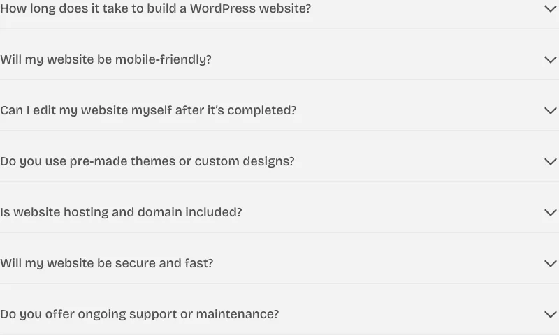
kadence/accordion wraps kadence/pane blocks. That’s your FAQ block.
Insert it and you get two panes, the first one open, sm padding inside each pane, a basic expand icon, and pane titles rendered as <div>s. You’ll change three of those.
Here’s the contact FAQ on this site, from the markup:
Accordion   paneCount: 7 · startCollapsed: true · linkPaneCollapse: true
            contentPadding: xxs top, 0 sides and bottom
            content border: 0 on all sides
            title: heading font family, weight 500, color palette5, background palette8
            title padding: xs bottom · marginTop: 32 between panes
Pane ×7     titleTag: h3
Four settings do the work for you. Here they are.
Start collapsed
Default is startCollapsed: false with openPane: 0, so the first question is open on load.
For an FAQ, you want them all closed. Your visitor scans seven questions and opens the one that’s theirs.
Seven open answers is a wall of text with extra chevrons. One open answer makes the first question look more important than the others, and it isn’t.
Link pane collapse
linkPaneCollapse: true (the default) means opening one pane closes the others.
Keep it for your FAQs. Turn it off for a terms-and-conditions page where your visitor might want two sections open to compare.
Title tag: h3, every pane
The pane’s titleTag is separate from the block, and it defaults to div.
The FAQ sits under an h2 (“Frequently asked questions” in an Advanced Text block above it), so every question is an h3. That gives your page a real outline: one H2, seven H3s, each answer under its question.
Screen readers get a navigable list of questions.
Google gets the same structure your SEO plugin describes in the schema.
Leave a pane’s tag at div and you get a heading-shaped thing that isn’t a heading. It’s the accordion’s version of the Advanced Text default trap, in the opposite direction.
The title style is the design
Kadence lets you style the pane title separately from its content: font, color, background, padding, border, and the space between panes. This is where your accordion gets its look.
The contact FAQ’s titles are palette5 text on a palette8 background, weight 500 in the heading font, with 32px between panes and no borders anywhere. It reads as a stack of soft gray bars, and the open answer sits in the white space under its bar.
The whole accordion lives inside a synced pattern called “FAQs Block,” so the same seven questions can be dropped onto another page and edited in one place. Do the same for yours.
Zero borders is the choice that makes it look designed rather than default.
The work is in the background color and the gap. That’s it.
The schema toggle
faqSchema: false by default. Turn it on and Kadence outputs FAQPage JSON-LD built from the pane titles and contents.
That’s a good feature if your site has no SEO plugin.
This site runs Rank Math, which already outputs FAQPage schema (which plugin, and why, is in the SEO plugins roundup). Two FAQPage blocks on one URL, with slightly different question text, is a mess Google resolves however it wants.
One source of schema per page. If your SEO plugin does it, the block doesn’t.
This single toggle is the most important setting in the block, and it’s a setting about you not using a feature.
The Tabs: Settings From the Homepage Services
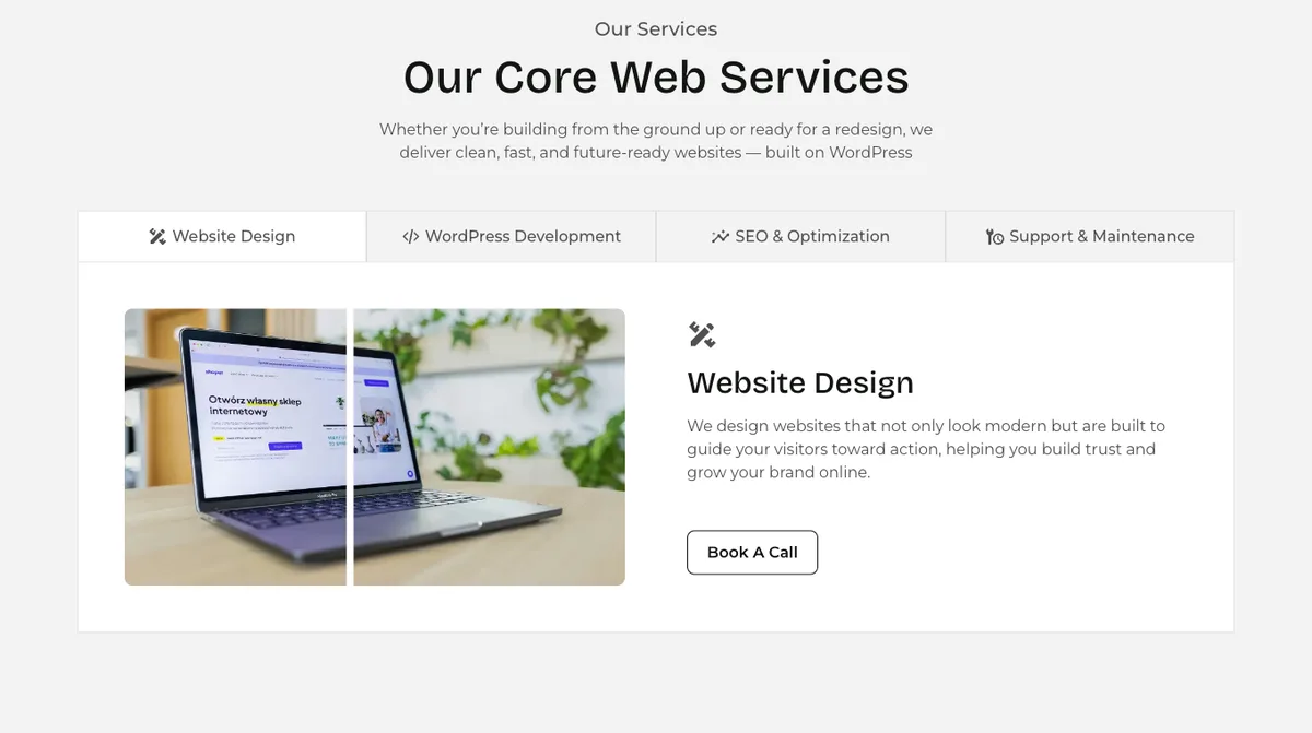
kadence/tabs wraps kadence/tab blocks. Same idea, opposite job.
Defaults you’ll inherit: three tabs, horizontal layout on every screen, titles left-aligned, sm inner padding, and a content border of #dee2e6 at 1px on all sides.
The services section on this homepage:
Tabs        tabCount: 4 · tabAlignment: center · enableSubtitle: false
            layout: tabs on desktop · tabletLayout: vtabs · mobileLayout: accordion
            innerPadding: lg (mobile: sm)
            content background: palette9 · border: palette7, 1px right/bottom/left, 0 top
            titles: Website Design, WordPress Development, SEO, … each with a custom SVG icon on the left
Tab ×4      each holds a two-column Row Layout, wider gutter, verticalAlignment middle, padding 0
Three layouts across three breakpoints
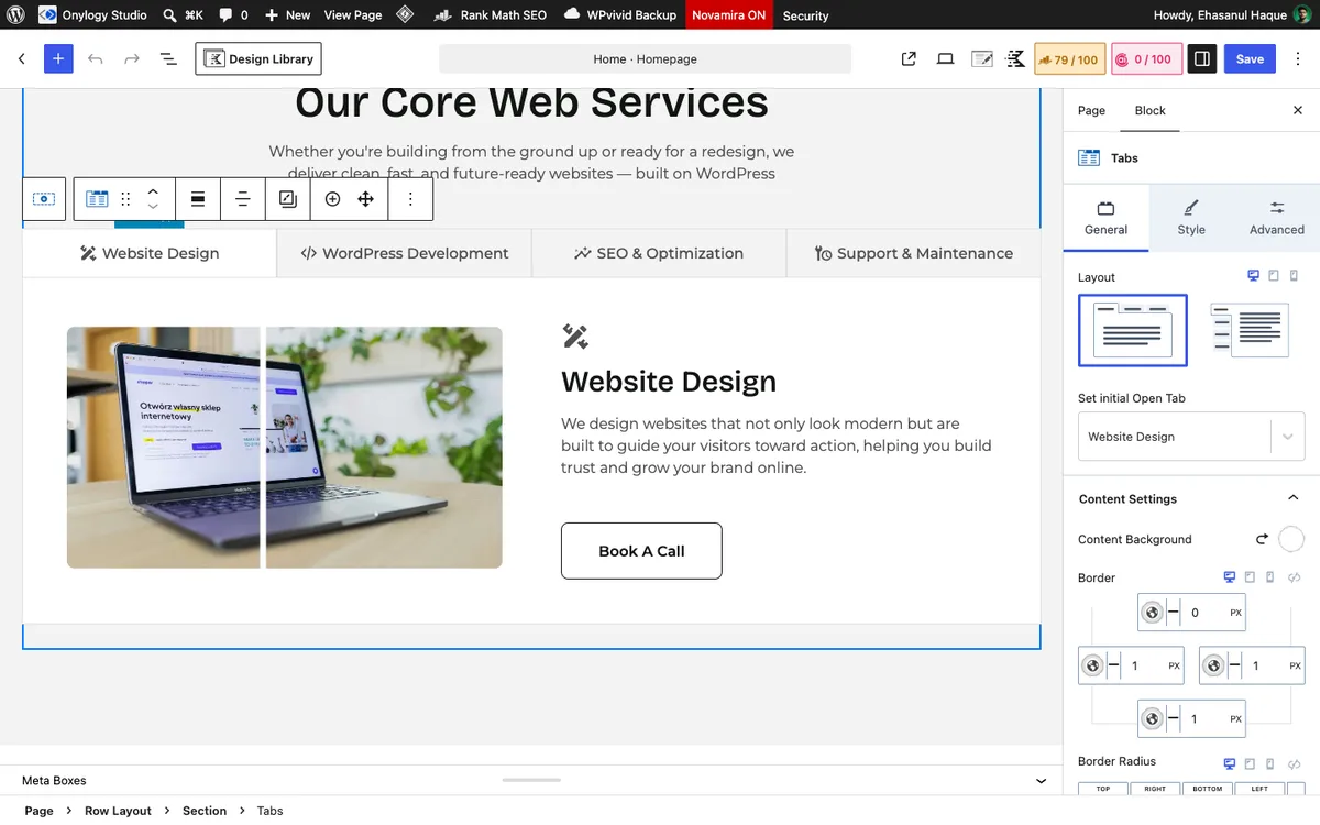
This is the setting that makes the block worth your time.
layout is the desktop value. tabletLayout and mobileLayout default to inherit.
On this site, tablet gets vtabs (titles stacked down the left, content on the right, which fits a portrait tablet better than four titles squeezed across). Mobile gets accordion, so the four tabs become four collapsible rows on a phone.
One thing to know about the mobile accordion: your visitor sees four gray rows, opens one, and reads it. They don’t know those were tabs. It’s the right fallback for a narrow screen, and it beats four unreadable tab titles. Just keep the titles short and clear, so the rows read as a menu.
Icons in the titles
Each title has an icon on the left of the text. Icons in your tab titles do two jobs: they make four short titles scannable, and they give the accordion fallback on mobile something other than plain text bars.
Kadence’s bundled icon set is fine for you here. The custom ones on this site came through the Pro SVG library and match the site’s line style.
Inner padding and content
The tab content is lg padding on desktop and sm on mobile. You set both in the same panel.
Each tab’s content is a two-column Row Layout with the wider gutter, a photo on one side and text on the other, verticalAlignment: middle. Tabs are a container.
What you put inside is built exactly like any other section.
The hardcoded gray
The tabs block’s default content border is #dee2e6. It’s the only hardcoded hex you’ll find in a Kadence block default, and if it looks familiar, it’s Bootstrap’s border gray.
Harmless. But if your borders are palette7 everywhere else, change it on the first tab block you insert, or it’ll be the one border on your site that doesn’t follow your palette.
When Each Block Is Wrong
- A services page with each service in a tab: wrong. Three of your four services are hidden from a visitor who doesn’t click, and de-emphasised for Google’s first pass. Give each service a section. Use tabs only for variants of one thing.
- A 40-question FAQ in one accordion: wrong. Split it into topic groups, each with its own H2 and accordion, or your page outline turns into noise.
- An accordion to hide long content so the page looks short: wrong, and Google reads the hidden text anyway.
- Tabs for a comparison (Plan A / Plan B / Plan C): wrong. Your visitor wants to see them side by side. Use a three-column Row Layout.
- Accordion for a step-by-step process: wrong. Steps should all be visible in order. Use Info Box with number media or a plain numbered list.
Which Setup Should You Copy?
- FAQ: Accordion,
startCollapsedon, every paneh3, titles onpalette8, no borders, 32px between panes, FAQ Schema off if your SEO plugin has it. Six to ten questions per accordion. - Services or features overview: Tabs, centred titles with icons,
vtabson tablet,accordionon mobile,lginner padding, a Row Layout inside each tab. - Terms, policies, optional detail: Accordion with
linkPaneCollapseoff so several can be open. - Anything the visitor needs to compare: neither. Columns.
Not sure? Ask whether your visitor might want the content or must choose between options. That answers it every time.
Final Thoughts
Seven closed questions on the contact page and four tabs on the homepage, both built from a handful of settings you now have, both inheriting the palette.
The schema toggle stays off because Rank Math owns that job. The pane titles are h3 because the outline matters. Everything else is a background color and a gap.
Accordion for “might want.” Tabs for “must choose.” Plain and simple.
Over to you: is anything on your site in a tab that a visitor would rather see without clicking? Let me know in the comments.
Frequently Asked Questions
What is the Kadence Accordion block?
A free Kadence Blocks block that stacks collapsible panes, each with a styled title and any content inside. It’s built for FAQs, terms, and optional detail, and can output FAQ schema if no SEO plugin already does.
How do I make the Kadence accordion start closed?
Turn on Start Collapsed in the block settings. By default the first pane is open on page load.
Should I enable FAQ Schema in the Kadence accordion?
Only if your site has no SEO plugin outputting FAQPage schema. Rank Math and Yoast both do, and two FAQ markups on one page conflict. Use one source.
What is the Kadence Tabs block?
A free block that splits content into panels with clickable titles, one panel visible at a time. It supports horizontal tabs, vertical tabs, and an accordion layout, set separately for desktop, tablet, and mobile.
How do Kadence tabs work on mobile?
However you set the Mobile Layout: inherit the desktop tabs, switch to vertical tabs, or collapse into an accordion. Accordion fits the narrowest screens best; keep the titles short so the rows read as a menu.
Can I add icons to Kadence tab titles?
Yes. Each tab title has an icon picker with left or right placement, and can show a subtitle line under the title.
Accordion or tabs for a services page?
Usually neither for the main content. Give each service its own visible section. Use tabs for short overviews of variants of one thing, and an accordion for questions most visitors won’t need.
You May Also Like
-

Kadence Blocks vs Elementor
Stuck choosing between Kadence Blocks and Elementor? Good news: the… -
Kadence Info Box Block
Building a services grid and wondering if the Kadence Info… -
Kadence Blocks Default Settings
Just installed Kadence Blocks and wondering which Kadence Blocks settings…