
- KadenceWP
- |
- WordPress
Kadence Info Box Block: Icons, Feature Grids, and Cards Explained
By Ehasanul Haque
Posted on September 27, 2026

Building a services grid and wondering if the Kadence Info Box block is the right tool?
Here’s an unusual place to start: there isn’t a single Info Box block on this website.
The homepage has a four-card feature grid, a three-card pricing-style strip, stat cards, a testimonial card, and a dark CTA card. Every one of them is a Section block.
That’s not a knock on Info Box. It’s a clue about what the block is for.
The Kadence Info Box is a single block that renders a card with a media slot (icon, image, or number) on top or to the side, a title, a paragraph, an optional “Learn More” line, and an optional link on the whole box, all styled from one settings panel.
It’s the block every “services grid” tutorial is built on. For a grid of six icon-title-text cards, it’s genuinely the fastest way for you to get there.
The trouble starts when your card needs one more thing.
This post covers what the block does, which defaults to change on day one, the one case where it beats a Section, and how to decide for your own grid. You’ll know in five minutes.
Let’s dive in.
What the Info Box Block Is
**Info Box is registered as kadence/infobox in free Kadence Blocks, with 89 attributes in version 3.7.10.**
The structure is fixed: a container, a media area, a title, a text area, a Learn More line.
You can hide the title, the text, or the Learn More. You can swap the media between an icon, an image, or a number. You can put the media on top or beside the text.
And the whole thing can be a link (that’s the default), or just the title, or just the Learn More text.
What you can’t do is put a block inside it. No inner blocks.
That’s the design, and it’s the whole trade.
The Defaults You Inherit
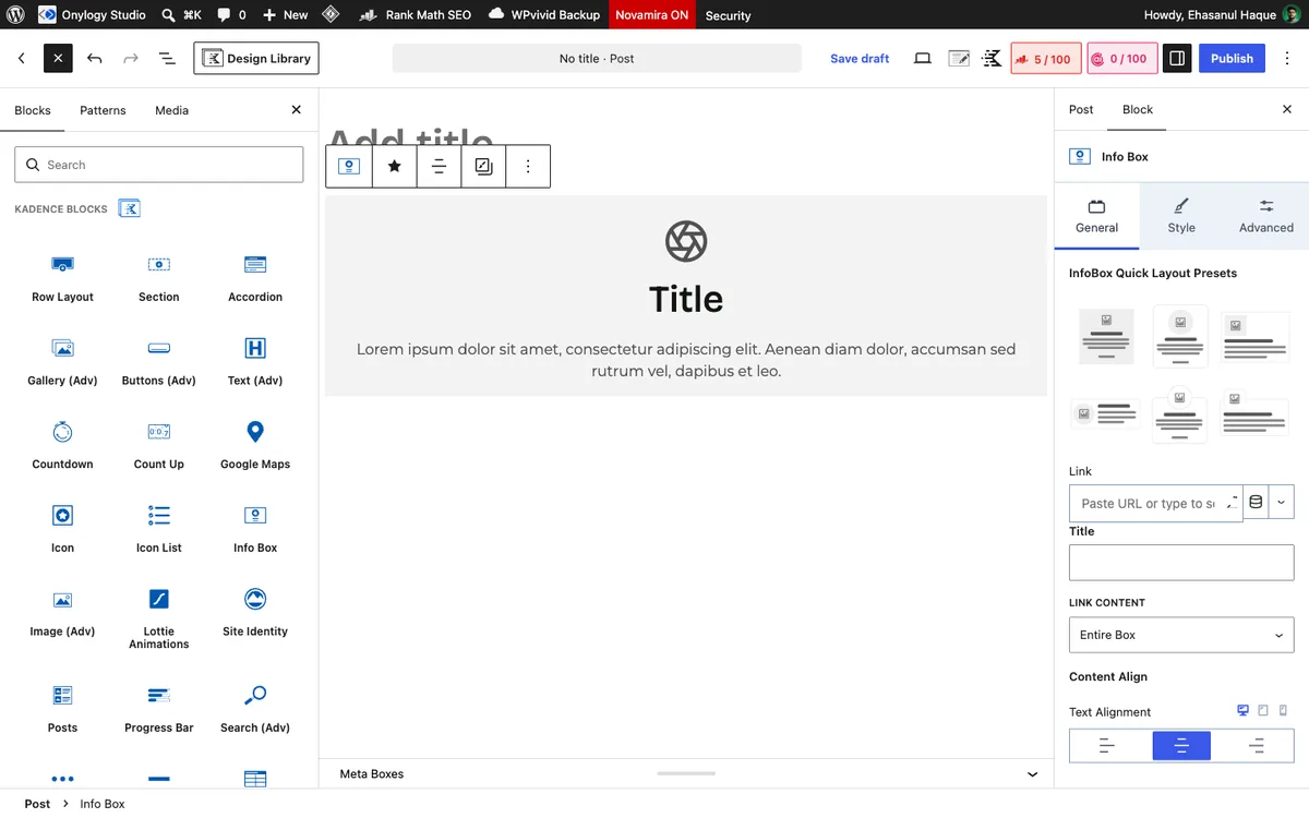
Insert one and this is what you get, and what you should change:
| Setting | Default | Change it to |
|---|---|---|
| Media type | icon | Fine |
| Icon | fe_aperture at 50px, stroke 2 | Anything else. It’s a camera aperture. |
| Container padding | xs (1rem) on all sides | sm or md to match Section cards |
| Horizontal alignment | center | left for text-heavy cards |
| Title tag | heading (which means an H2 by default) | h3, always, inside a section that already has an H2 |
| Learn More | Hidden; text “Learn More” | Leave hidden unless the card is a link |
| Link | Whole box, same tab | Fine if the card links anywhere |
| Container background | None | palette9 or palette8 from the palette |
That aperture icon is on every freshly inserted Info Box on every Kadence site in the world. It’s an easy one for you to forget on the sixth card of a grid.
Change it first.
The title tag matters for the same reason it matters on Advanced Text: the default gives you an H2, and a grid of six Info Boxes under a section heading becomes six extra H2s.
Set every card title to h3. Two seconds per card, and your heading structure stays clean. You’ll thank yourself when you read the SEO guide.
It Is a Locked Card
Here’s why this site has none.
A card on a real homepage rarely stays icon-title-text.
Your client wants a button in it. Then a price. Then two lines of small print under the price. Then a checklist.
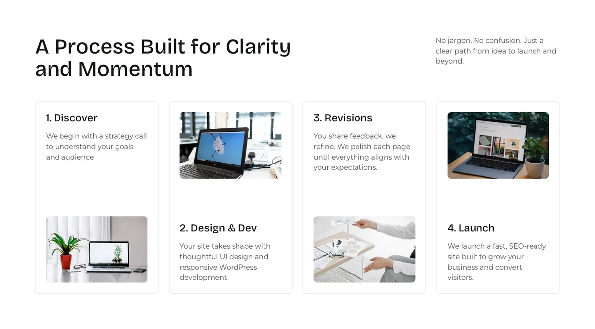
The four feature cards on this homepage each hold an image pinned to the bottom with the text pinned to the top, and the even ones flip image and text on mobile. The cards in the client-quotes band hold a name, a company line, a quote, and in one case a stat row and a button.
Info Box can’t hold any of that. So the first time your card grows, you rebuild it as a Section, and you’ve built it twice.
The fix is to build it as a Section the first time. A Section with sm or md padding, an 8px radius, a palette8 or palette9 background, and whatever blocks your card needs inside: an Icon block, an Advanced Text h3, an Advanced Text p, a button.
It’s four blocks instead of one. And your card can become anything you need later.
Already got a six-box services grid built with Info Box, and it’s fine? Leave it. It’s fine. This is about what you reach for on the next one.
The One Thing Info Box Does Better
The whole-box link.
linkProperty: "box" makes the entire card clickable, with hover styles for the container, the icon, and the title all in one panel.
A Section can carry a link too (its link attribute wraps the whole column). But the hover states are yours to build, and if you put a button inside a linked Section you get a nested link, which is invalid HTML.
So here’s the honest case for Info Box: a grid of cards where each card is a link, holds nothing interactive, and wants a hover effect.
Category tiles. A “choose your service” grid that goes to six pages. Team members linking to bios.
For that, Info Box in five minutes beats Sections in twenty, and you get the hover for free.
Most linked-card grids do end up wanting a button eventually, at which point the box link has to go. But if yours won’t, this is your block.
Layout Options Worth Knowing
- Media beside text (
mediaAlign: leftorright) turns the card into a horizontal feature row, an icon with a title and a sentence beside it. Good for a “why us” list where a full card is too heavy. - Number media (
mediaType: "number") puts a big styled number where the icon would be. Steps in a process, “01, 02, 03.” It’s the best-looking way to do numbered steps in Kadence without a plugin. - Image media with a flip image on hover. Clever, rarely wanted.
- Learn More shows a styled text link at the bottom. If the whole box is already a link, it’s decoration, so pick one.
That’s the whole options list you need. Everything else is styling you’ll set once.
Which Should You Use?
- Six equal cards, icon + title + one paragraph, each linking somewhere: Info Box. Set
h3, change the icon, bump the padding. - Cards with a button, a price, a list, an image that needs to pin to the bottom, anything that might grow: Section. See the Row Layout post for the card recipe and the homepage walkthrough for it in context.
- A numbered process (01, 02, 03): Info Box with number media,
mediaAlign: left. - A “why us” list with an icon per line: Info Box with media beside text, or the Icon List block if the lines are short.
Not sure which yours is? Ask one question: will this card ever need a button?
If yes, Section. If no, Info Box. Plain and simple.
Final Thoughts
Info Box is a good block for one shape of card and a trap for every other shape.
This site’s cards all outgrew that shape before they were finished, which is why there are none. Yours might not, and that’s fine.
The whole-box link is the real argument for it. Every time you build a category-tile grid, Info Box is the right tool for an afternoon.
**Change the icon, set h3, and know what the card will need to hold before you pick. That’s it.**
Over to you: look at the cards on your homepage. How many hold something an Info Box can’t? Let me know in the comments.
Frequently Asked Questions
What is the Kadence Info Box block?
A free Kadence Blocks block that renders a card with an icon, image, or number, a title, a paragraph, an optional Learn More link, and an optional link on the whole box. It’s built for feature grids and service cards.
Can I add a button inside a Kadence Info Box?
No. Info Box has no inner blocks. For a card with a button, list, or extra content, use a Section block with the blocks you need inside it.
How do I make the whole Kadence Info Box clickable?
It already is by default: the Link Property setting is “box.” Add a URL in the link field and the entire card becomes the link, with hover styles from the same panel.
What heading tag should Info Box titles use?
h3 inside a section that already has an h2. The default title tag renders an H2, which turns a grid of cards into a row of section headings.
Info Box or Section block for a services grid?
Info Box if every card is icon, title, text, and nothing else, especially if each card links somewhere. Section if any card needs a button, price, list, or image that pins to an edge.
Can I put the icon beside the text instead of above it?
Yes. Set Media Align to left or right. That turns the card into a horizontal feature row.
Is the Kadence Info Box block free?
Yes, it’s in the free Kadence Blocks plugin. Pro adds nothing to this block.
You May Also Like
-

Kadence Blocks vs Elementor
Stuck choosing between Kadence Blocks and Elementor? Good news: the… -
Kadence Accordion & Tabs Blocks
Got a page with too much on it, and wondering… -
Kadence Blocks Default Settings
Just installed Kadence Blocks and wondering which Kadence Blocks settings…