
- WP Plugins
- |
- WordPress
How to Build a Homepage or Landing Page with Kadence Blocks: A Step-by-Step Walkthrough
By Ehasanul Haque
Posted on September 19, 2026
Ready to build a homepage with Kadence Blocks and not sure where to start?
Start with the questions, not the blocks.
The homepage of this site has nine sections, in the order your visitor asks questions:
- Who are you? (hero)
- Who else trusted you? (logos)
- What do you do? (services)
- Show me. (work)
- How does it go? (process)
- Who’s behind it? (about)
- Says who? (testimonials)
- What do you know? (blog)
- OK, what now? (CTA)
That order was decided before a single block was placed. Every section below answers its one question and hands off to the next.
A homepage built with Kadence Blocks is a stack of full-width Row Layouts, one per section, each holding a Section block at content width with a nested Row Layout for its grid, so every section shares the same spacing scale, palette, and rhythm without a page builder.
This is a walkthrough of that page, section by section, with the block tree for each one pulled from the live markup. The landing page version is at the end.
You don’t need to be a designer. You need the nine questions and one shell.
Let’s dive in.
Before You Place a Block
Set the palette, fonts, and container width in the Customizer first. Every section below inherits from them, and nothing in this walkthrough sets a color or a font size on a block.
Then write your nine headings.
If you can’t write a section’s H2 in one line, the section isn’t clear enough to build yet. Fix the sentence before you touch a block.
Section 1: The Hero
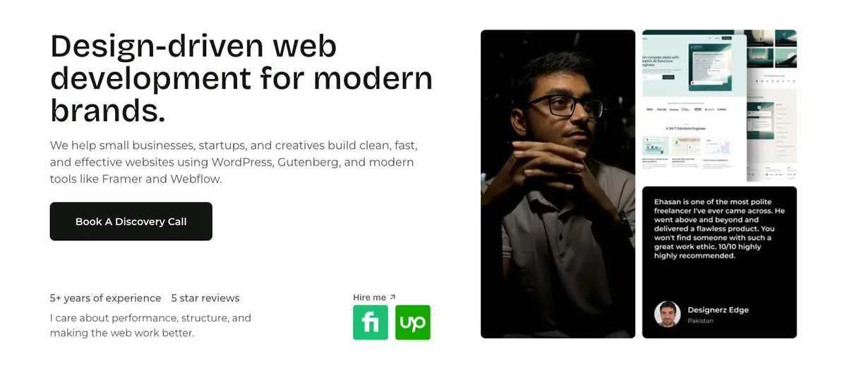
Row Layout    align: full · 2 columns, equal · gutter: wider (64px) · padding: lg top, xl bottom
  Section     direction: vertical      ← the photo
    Advanced Image    medium_large, preventLazyLoad: true
  Section                              ← the words
    Advanced Text     h1 · margin xs below
    Advanced Text     p · 1.125rem · margin sm below
    Advanced Button   "Book a discovery call"
    Spacer            80px (60 on mobile)
    Row Layout        left-golden · padding 0
      Section         stats ("5+ years of experience", "5 star reviews")
      Section         "Hire me ↗" label + Fiverr/Upwork icons
The hero is two columns: photo left, words right. On mobile, the photo column is reordered so it still comes first for your visitor.
The H1 is the only H1 on the page: “Design-driven web development for modern brands.” Under it, a lead paragraph at 1.125rem, the one paragraph on the page allowed a size. Then one button.
One. A hero with two buttons is a hero that hasn’t decided.
The stats row underneath is a nested left-golden Row Layout. The hero is mostly the Advanced Text block, so that post covers the rest of it for you.
One performance decision lives here and nowhere else: the photo has preventLazyLoad: true. It’s the largest thing above the fold, it’s your Largest Contentful Paint element, and lazy-loading it would make the browser wait to fetch the one image it needs first.
If you take one speed setting from this post, it’s that toggle on the hero image. The speed guide explains LCP if the term is new to you.
One H1. Then Stop.
Every section heading from here down is an h2. Every card title inside a section is an h3.
The Advanced Text block defaults to a heading, so you set the tag by hand on every one you insert. On this page, that’s 23 blocks.
That’s the whole SEO of your page structure, and it takes ten minutes.
Section 2: The Logo Strip
Row Layout    align: full · 1 column · bgColor palette8 · padding: 3xl top and bottom
  Section
    Advanced Text     h2, centred: "Companies that we worked for" · 1.25rem
    Section           direction: horizontal · justifyContent center · verticalAlignment middle
      core Image ×6   grayscale duotone
    Advanced Text     p · sm · pill (padding xxs/xs, radius 365)
Six client logos in a horizontal Section, all run through the core Image block’s grayscale duotone so six brand colours don’t fight your page.
That’s the only place the page uses core Image instead of Advanced Image, because the duotone filter is a core feature.
One honest note: logos this early say “others trusted us” before your visitor knows what you do. It works here because the hero already answers that in one line, and because the section is short.
If your logos are weak, skip this section entirely rather than pad it.
Section 3: Services (Tabs)
Row Layout    (same band, continues)
    Advanced Text     p, centred, 1.25rem (kicker)
    Advanced Text     h2, centred: "Our Core Web Services"
    Advanced Text     p, centred, margin lg below
    Tabs              4 tabs · centred titles with custom SVG icons
                      desktop: tabs · tablet: vtabs · mobile: accordion
                      innerPadding lg · bg palette9 · border palette7
      Tab ×4          Row Layout, 2 columns, wider gutter, verticalAlignment middle
                        Section: image · Section: h3 + p + button
Website Design, WordPress Development, SEO, Support. Four facets of one service, each a sentence and a link.
That’s the only situation where tabs are the right block for services. If each of your services is a separate offering with its own audience, build four sections, not four tabs.
The Accordion & Tabs post covers the settings you’ll need.
Section 4: Work (Query Loop)
Row Layout    align: full · 1 column · padding: 3xl top, xxl bottom
  Section
    Row Layout        left-golden · verticalAlignment bottom · margin lg below
      Section         Advanced Text h2: "Websites That Speak for Themselves"
      Section         Advanced Button, right-aligned
    Query Loop        saved query → portfolio post type
The heading-left, button-right row is a pattern you’ll see three times on this page, always left-golden with verticalAlignment: bottom so the button sits on the heading’s baseline.
Under it, a Query Loop renders the portfolio posts as cards. It’s a Pro block, and it’s the reason this site is on Pro: the cards look like the rest of the page, and adding a project to the portfolio adds it here.
Don’t have Pro? This section becomes the free Posts block on the portfolio post type. Plainer, but honest.
Section 5: Process (Four Cards)
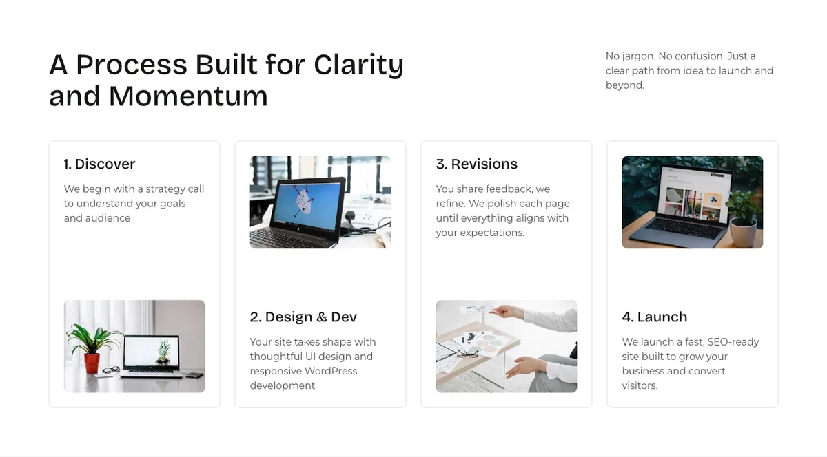
Row Layout    align: full · 1 column · padding: xxl top and bottom
  Section
    Row Layout        left-golden · margin lg below
      Section         h2: "A Process Built for Clarity and Momentum"
      Section         p (intro)
    Row Layout        4 columns · gutter custom 24px · padding 0
      Section ×4      radius 8 · padding sm · verticalAlignment space-between
                      Section (h3 + p) · Advanced Image (radius 8)
                      cards 2 and 4: direction vertical-reverse on mobile
“1. Discover” and three more steps.
Each card is a Section, not an Info Box, because each holds a numbered H3, a paragraph, and an image pinned to the bottom edge with space-between. The even cards flip image and text on mobile so the column doesn’t read as image-text-image-text.
The Info Box post explains why cards that hold this much are Sections.
Section 6: About (Split)
Row Layout    align: full · 2 columns · gutter wider · bgColor palette8 · padding xxl
  Section                              ← words
    Section
      Advanced Text   h2: "About Onylogy Studio"
      Advanced Text   p · margin 12 below
      Advanced Text   p · margin 40 below
      Row Layout      3 columns · gutter skinny · verticalAlignment bottom
        Section ×3    stats
  Section                              ← image
    Advanced Image    radius 9
The classic split: text left, image right, wider gutter, second alternating band.
A three-column stat row with the skinny gutter sits under the paragraphs.
No Split Content block. A two-column Row Layout is the same layout, and it’s free.
Section 7: Proof (Testimonials Band)
Row Layout    align: full · 1 column · bgColor palette8 · padding xxl
  Section
    Advanced Text     h2, centred: "Here's what our clients have to say"
    Advanced Text     p, centred, margin 40 below
    Row Layout        3 columns · gutter custom 24px · margin 40 below
      Section         radius 8 · padding md: name · company · quote · stat row
      Section         radius 8 · verticalAlignment bottom: "Watch the review" button
      Section         radius 8 · padding md · space-between: second quote
    Section           direction horizontal · justifyContent space-between · verticalAlignment middle
      Advanced Text   p: "Let's discuss your business goals…"
      Advanced Button "Let's talk" (secondary style)
Two client quotes, one in a dark card and one in a light one, with a “Watch the review” card between them.
Built from Sections rather than the Testimonials block. The Testimonials post explains when you should use the block instead, and this is one of those cases.
The thin bar under the cards, a horizontal Section with a sentence and a button, is your mid-page CTA. Every long page needs one.
Section 8: Blog (Query Loop)
Same shell as Section 4: heading-left, button-right row (“Insights & Ideas” and a “View all Blogs” button), then a Query Loop pulling the latest posts. xxl padding, no background.
Identical structure to the Work section on purpose.
Your visitor has already learned what this shape means.
Section 9: The CTA (Reusable Block)
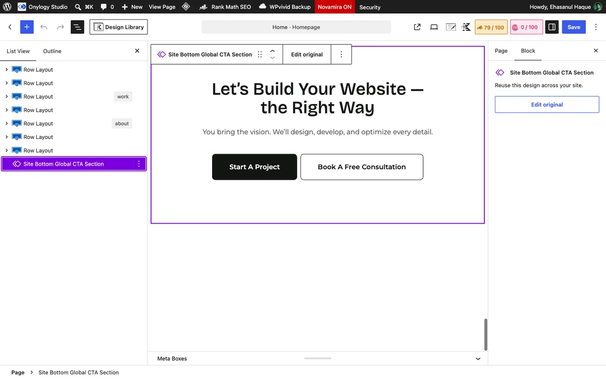
core Block ref → "Site Bottom Global CTA Section"The last section on the homepage isn’t built on the homepage.
It’s a synced pattern titled “Site Bottom Global CTA Section,” and it closes every page on the site: a heading that starts “Let’s Build Your Website,” one sentence, and two buttons, “Start A Project” and “Book a Free Consultation.”
Yes, two. It’s the one place on the site with a pair, because it’s the last thing your visitor sees and the two actions are genuinely different.
Change the wording once, and the contact page, the work page, and every service page change with it.
If you build one thing from this post as a reusable block, it’s this one.
Turning It Into a Landing Page
Building a page for one campaign? Your landing page is this homepage with the exits removed. Keep and cut:
- Keep the hero, with the campaign’s one promise as the H1 and the campaign’s one action as the only button.
- Cut the logo strip unless the logos are the argument.
- Cut the services tabs. A landing page has one service. Its section is the process grid or a benefits grid, not a chooser.
- Keep one proof section, the testimonials band, and give it real names and faces.
- Cut both Query Loops. Work and blog are exits, and a landing page has none.
- Keep the CTA, but not the shared reusable block. A landing page’s CTA says the campaign’s action, so it’s a one-off Section.
- Add the form. The Advanced Form goes on the page itself, above the footer, so the action doesn’t require a click away.
Five sections: hero, benefits, proof, form, CTA. Same shells, same padding, same palette you already set.
Set the page’s template to one without the header navigation if your theme offers it, so the only way off your page is the form.
Which Order Should You Copy?
- Service business homepage: the nine above. Drop the logo strip if your logos aren’t strong.
- Portfolio-first business (design, photography): move Work to Section 2, drop the process grid.
- Local business: hero, services as sections not tabs, proof, a map and hours section, CTA.
- Landing page: five sections, no exits, form on the page.
Not sure which you are? Write the questions your visitor asks, in order.
The sections fall out of your list.
Final Thoughts
Nine questions, nine sections, one shell repeated with different insides.
The order was the design decision. The blocks were the afternoon after.
Decide the questions first, build the shell once, and every section you add will match. Plain and simple.
Over to you: write your homepage’s section headings as the questions a visitor asks. Which section can’t answer one? Let me know in the comments.
Frequently Asked Questions
How do I build a homepage with Kadence Blocks?
Set the palette, fonts, and container width in the Customizer, decide the section order, then build each section as a full-width Row Layout with a Section at content width and a nested Row Layout for the grid.
What sections should a homepage have?
The ones that answer a visitor’s questions in order: who you are, what you do, proof of work, how it works, who’s behind it, what clients say, and what to do next. onylogy.com uses nine; a landing page needs about five.
Do I need Kadence Blocks Pro to build a homepage?
No. Every section here is free blocks except the two Query Loops that pull portfolio and blog posts. Without Pro, use the free Posts block for those.
How do I make a section full width in Kadence?
Set the outer Row Layout’s alignment to Full. The background spans the browser while the content stays at the theme’s container width.
Should I use a Kadence starter template?
As a reference, yes. As a page, only after you’ve decided your section order, or you’ll spend longer deleting than building.
How is a landing page different from a homepage in Kadence?
A landing page removes every exit (navigation, work and blog loops, service choosers) and adds the form to the page itself. Same blocks, fewer sections, one action.
How many Row Layout blocks is too many on a homepage?
This homepage has 19 and renders fine. Count levels, not blocks, and stay under four levels deep.
You May Also Like
-

Kadence Blocks Default Settings
Just installed Kadence Blocks and wondering which Kadence Blocks settings… -
Kadence Blocks for WordPress
Building your WordPress site with Kadence Blocks? Good choice. It’s… -
Kadence Blocks vs Spectra vs Stackable
Looking for the best Gutenberg block plugins and finding the…